

Models by Xinyi Li @x1n.o
Collection 1, born from elegant styles of attachment.
In this second collection, I am thinking about connection, exploring how we attach and attract beauty, to others, for others, to and for the garments which embrace us. As I have come to understand in my quest for elegance, aesthetics cannot fully bridge out understandings. Elegance is not merely aesthetic, but rather lived, relational between bodies and tangible experiences, living between the wear and the worn, the people and the clothes. Just as our silhouette is able to speak to out deepest needs for clarity, for security, for shine, through elegance we reach for comfort, for closeness, for the assurance we exist. My gradients in this collection do not simply transition between colors; they map the spectrum of human attachment—from the anxious pull of uncertain love to the secure embrace of trust realized over time.
I might be chasing at an angle, seeking something more complex, more layered, more burdened, but elegance never changes, it remains true to its path, never wavering as we around it might. How elegant it is to have someone who knows how to love without losing themselves, who can attach without clinging, who can remain beautiful even in their vulnerability. I have designed these pieces to reflect the four attachment styles. I am not a therapist, I am a designer. But through the emotional architecture my lines create, I see the potential for these subjects to overlap. At this point, I will refrain from writing elementary cliches and long winded forms of self flattery, such that “The secure pieces breathe with confidence, their gradients flowing like exhaled relief. The anxious pieces hold tension in their transitions, beautiful but restless, seeking resolution. The avoidant garments maintain their elegance through distance, their gradients cool and controlled, protecting even as they attract. And the disorganized pieces—perhaps my most ambitious—capture the push and pull of conflicted desire, gradients that seem to argue with themselves yet somehow achieve harmony.” If you expected this section and miss it, drown yourself in the aforewritten lines and be gone with it.
To me, this collection is meant to speak to how we dress ourselves emotionally, how we choose garments that either soothe our attachment wounds or celebrate our capacity for connection. Simplicity remains my north star, but now it is simplicity that serves psychological truth rather than merely aesthetic preference. If done write, simplicity will always be a pillar and the singular cornerstone from which elegance sprouts. I am not interested in fashion as costume or fashion as armor; I am interested in fashion as translation, and in that translation, aspects of expression—though not too much.
I will not lie to say I know why people choose a piece of whatever over another for the sake of echoing a thought process I can never explain, but rather I want to stress the existence of my side as a creator, that has turned these idea which spoke to me specifically a tiny bit more within reach for those who might come to find themselves in tune with. I want people to choose these pieces not just for their beauty, but for their emotional resonance, for the way they hold space for the complexities of human attachment while maintaining the refined grace that is my signature.
This collection acknowledges that true elegance must account for our messiness, our need, our beautiful and imperfect ways of loving. It is elegance that includes rather than excludes, that honors the full spectrum of how we connect. I am no longer content to design for the person who has transcended need; I want to design for the person who needs beautifully, who attaches with grace, who finds in my garments not just elegance, but home.
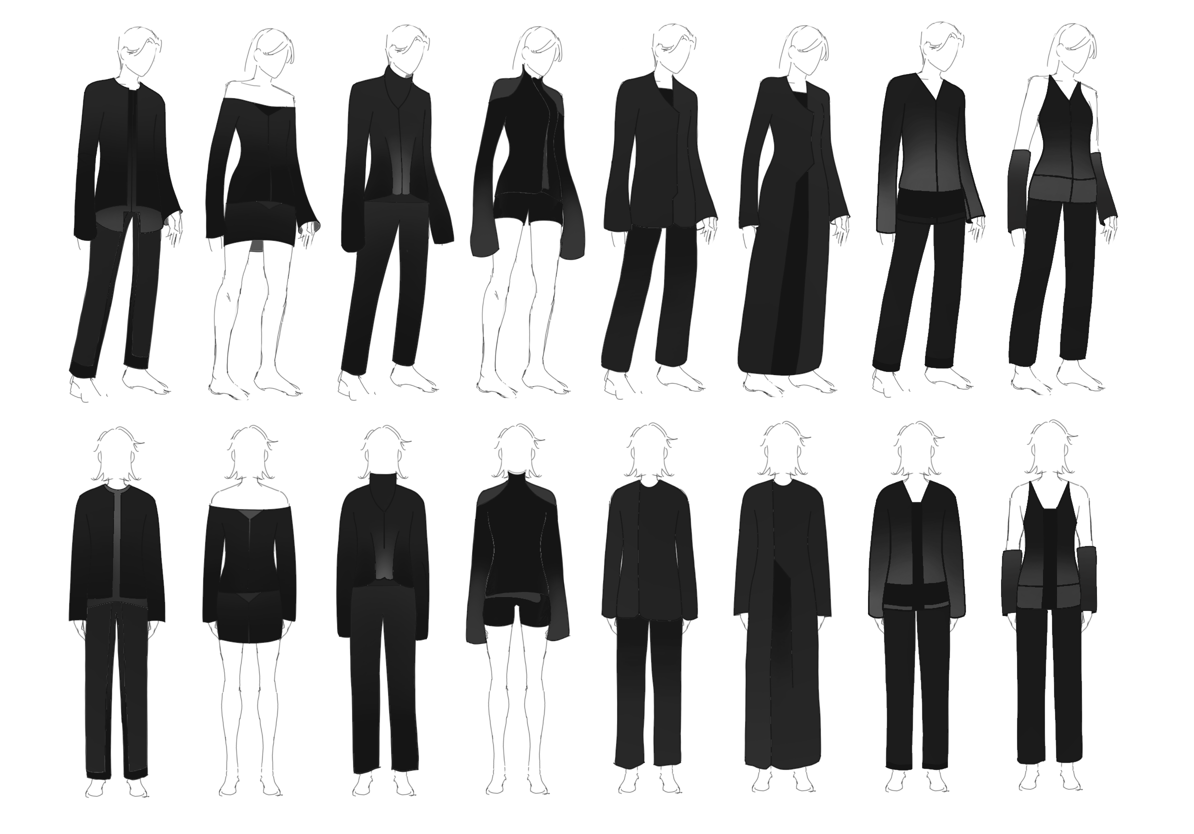
Designing Collection 1
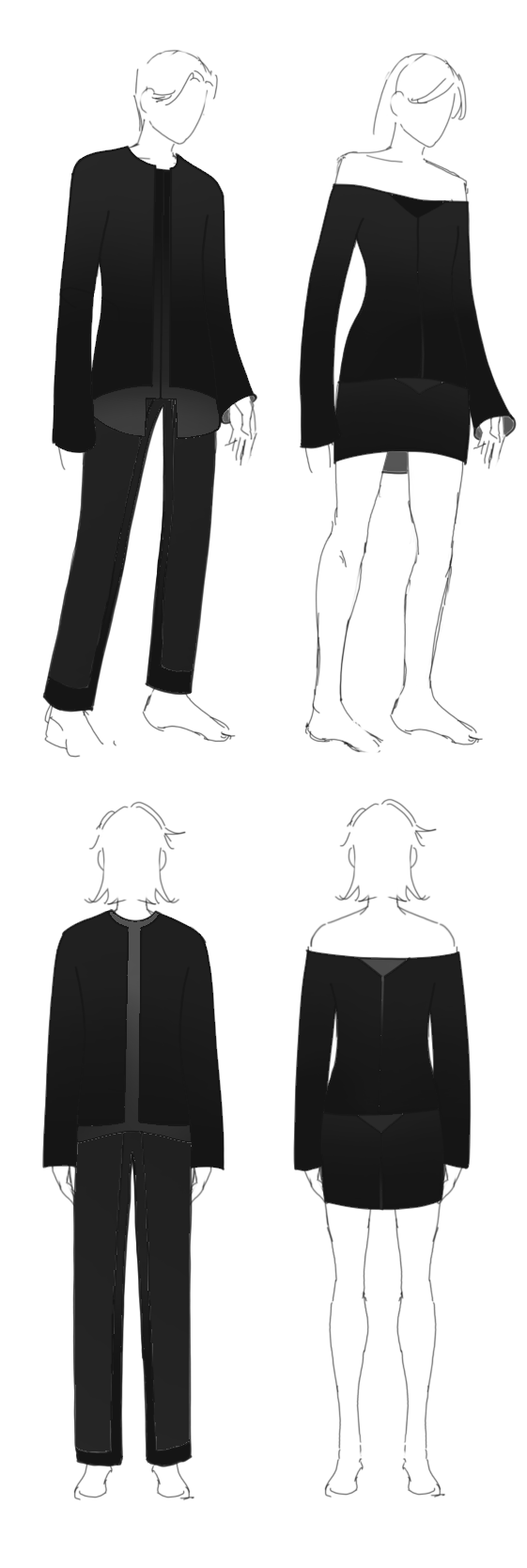
Pair 1 [No.1 / No.2]
With attachment at the center of this collection, naturally I continued the focus on pairing elements of design, both through matching diagonals, paralleled through color and textile layering choice, but also with interjectors of full opposing extremities on design, for, as mentioned previously, contrast is supremely elegant. The idea behind the center stand is that the under layer merely borders the outer shapes, adding an outline which specifies the turning points around the waist. For the female model, since no element of the waist is encircles, that line becomes situated when looking next to the male model, only carried over in our own interpretation, though physically it brings the burden upon her skirt. The central color is a muted gray, acting as the 0 on the hex axis. It bears no specific selection reason, besides that it averages the lightest point with the darkest black. The center point for the chest, in both models, is where I wish the focus to be after a journey that lingers and traces the form. Obviously, the high contrast will grab the viewer’s attention, but I wish it to not remain on the back panel, on the front of the waist, and most importantly, not on the models wearing the designs themselves. The least we could do it lay them off this burden of attachment to the clothes, an unwavering yet unavoidable act of judgement. Very clearly, the off shoulder look in accordance with the low cut skirt is in contrast with the male pairing, I wanted to be able to paint just the same variation in color and the full dashing board of hex on a much smaller, tighter, constraining panel. It called to deform shapes, and in the previously mentioned case of the waist, of removing the predetermined front-around-back logistic of tracing in its entirety. The front vertical panel on the male model has been reduced to a line whereby the gradience will show through the seam stitching, with the line pre-dyed, of course. The indented opening which supports an ergonomic zip motion and conforms to the front has been replaced by the upside down triangle, matching the chest, though with a slightly different intention. In the male model’s design, it acts at the bottom most point, thus supporting the lightest color when viewed from the front. For the female mode, however, its color palette overall, reins much darker, as when I made the choice to cut down my surface area, I chose to cut literally, and not conform the existing elements to a smaller border. The extremities are gone, and with that reasoning, I leave the outfit with less room for balance, less coordinated gradience, and an overall lower contrast front, comparatively or not. The inside of the clothing, as seen through the sleeves, the lining and what usually not shown to others, are coordinated with the average gray, the central color previously mentioned, which exists both in the front and back view, at the stomach and the uterus, the lumbar spine and the lumbar spine respectively. When worn, it is imagined that the front chest of the female model will naturally, due to the off shoulder aspect, form a wide, obtuse v-shape, which, in hindsight, could parallel literally the male model’s back waist.
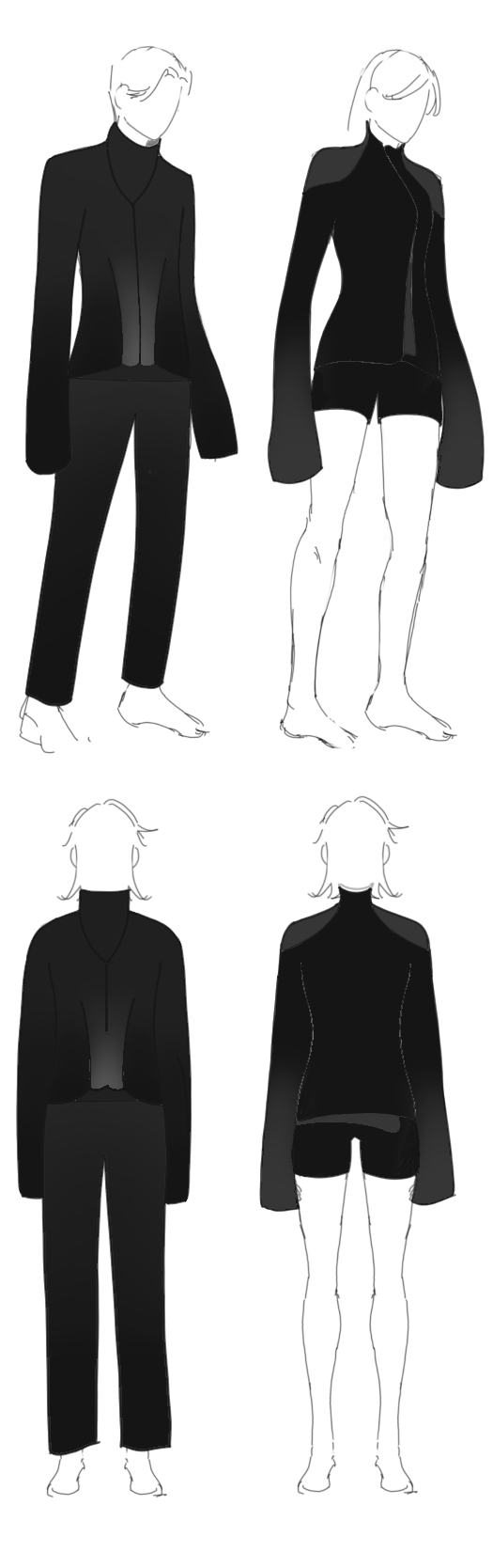
Pair 2 [No.3 / No.4]
This second pair is mainly inspired by my desire to cover up the hands. I have always appreciated long sleeves, especially those which drape over and lengthens when it is expected otherwise. The tenderness which comes from knowing the hands still exist under the sleeve but never visible brings no further benefit then knowing that very tenderness. I also wanted there to be slanting aspects which protrude, or, in the male model’s case, evades from the main body of the garment. In the front and the back waist level, there peeks out a second under layer which acts as the central gray, morphing both the brightness above, the darkness to the side, and the neutrality below. On both front and back, it becomes the connecting point of all the strands. The neck hold is also of the same central gray, though its shape stems from traditional leatherwear, whereby a tube surrounds and protrudes the same way as the neck, providing a much more accompanying shell. I wanted to have it done with fabric, for it will surely mitigate the sharpness of the leather’s edge, and provide the cushion that fabric will bring along. For the female model, a much tighter fitting neck brace seemed more suitable, and the contrast not only rests in the room allotted for the neck, but also the joinery for the skin, when the form finally ends and the skin shows. While the male model’s neck remained free consistently traced outward, the female model’s tight em-brace also comes with curvature at the zipper, averaged from both sides curve considered. She also dons shoulder pads, for in this case, with the key focus on the upper body, further exposing of the shoulders would torpedo inelegance. The pads, the zipper, and the end of the sleeve, are all neutral gray, this idea that stretches the border of the end point, and allows that color, on the female model, to rest only where the clothes identify its extremities. The front panel is in accordance with the male model’s, though single stranded. It only peeks out, and, as the jacket is already asymmetrical, furthers that motion, like a page sticking out in a book. On the back, where as the male model’s front back balance calls for the shape to be contoured again, the female model’s back is fully black, with no extremities, also comes with no neutral gray-dient. I wanted there to still maintain that balancing act, so, in matching with the front, I off centered another panel, peeking, though not opening. The pack panel in its entirely does not evade it by shifting. The whole top of the female model does not shift, but rather elements peek out, whereas the male model’s top shifts in order to form layering in a confined, predetermined outline.

Pair 3 [No.5 / No.6]
I didn’t want the forms of this pair to coincide in a structural sense, and yet they turned out is visually similar. I find that the length of a garment, whether at the sleeves or at the opening can always be extended a few inches spatially. I wanted the color to remain as dark as possible, yet with the thread be a distinguishable factor in shape, all tied together with gradience when it is complicit. I originally thought to create a back panel on the male model that of which associated the language from the coat of the female model, but it forces me to accept that it might not be suitable, and that the parallel shall live on through the front clasp, though different through exaggeration. I wish it can still come across the difference in sleeve width, and how the male model’s sleeve forces a silhouette of symmetrical flare vertically, negating a further need for a distinguishable element in my opinion while being capable to fully re-encloses itself. In both models, the back, seemingly asymmetrical, is matched over when doing a side positioned shift, and this matching the flaps at the front, re-instating symmetry. I kept the male model’s pants to have the darkest black in the pair, suitable in comparison to the female model’s front panel, which, alongside the matching chest black, is suitable in surface area to create a matching visual.
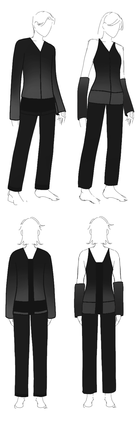
Pair 4 [No.7 / No.8]
I always liked arm warmers, and I associated such a garment both with a armor-like connotation and yet the visually cute accessory. Another major theme in this pairing is the upside down crosses, which find its own emergence as gradient determines it. In the female model, the gradient in the arm warmer and the main upper-body is opposite in distinction and in direction, though visually having reached the blackest area of the garment. The cross separates the top vertically and, in splitting the straps, extends down into the pants, once again separating the legs. I imagine that when held at position, the top half’s arm warmers would have enough darkness to gradually blend into the darkest aspects of the pants. However, it it notable that the cross has been chosen to be knit of that very black throughout, uncompromising in its gradience and stringent in its activity. In the back, I wanted the female model’s top to be able to replicate that of the front, once again, separating the straps, upside down cross, maintain the darkest shade of black. Moving momentarily to the male model, the cross is much thicker, and much less visible from the front. With the horizontal aspect maintained at a thick stripe, though I do acknowledge the encircling of the shape to allow for absolutely zero shifting around, I decided to allow the gradience of the block beneath it to reveal the cross in the back, as the darkness is brought to light, the very light which starts the vertical ascent. In the male model, the horizontal line is thicker. In the female model, the vertical line is thicker. Since the male model had no room for arm visibility, I set in tone the circling gradience beneath the cross to substitute for the arm warmers of the female model’s gradience. The pairing also plays on the idea that the beck opening stray away from either a V or a U, forming throughout the observational experience, a settling, somewhat morphed idea of an in-between, virtually shifting and ultimately dependent on the viewer.
Modeling Collection 1
The clothes will not walk on the runway. They will remain still.
They need to be seen as clothes before they can be seen on body.