


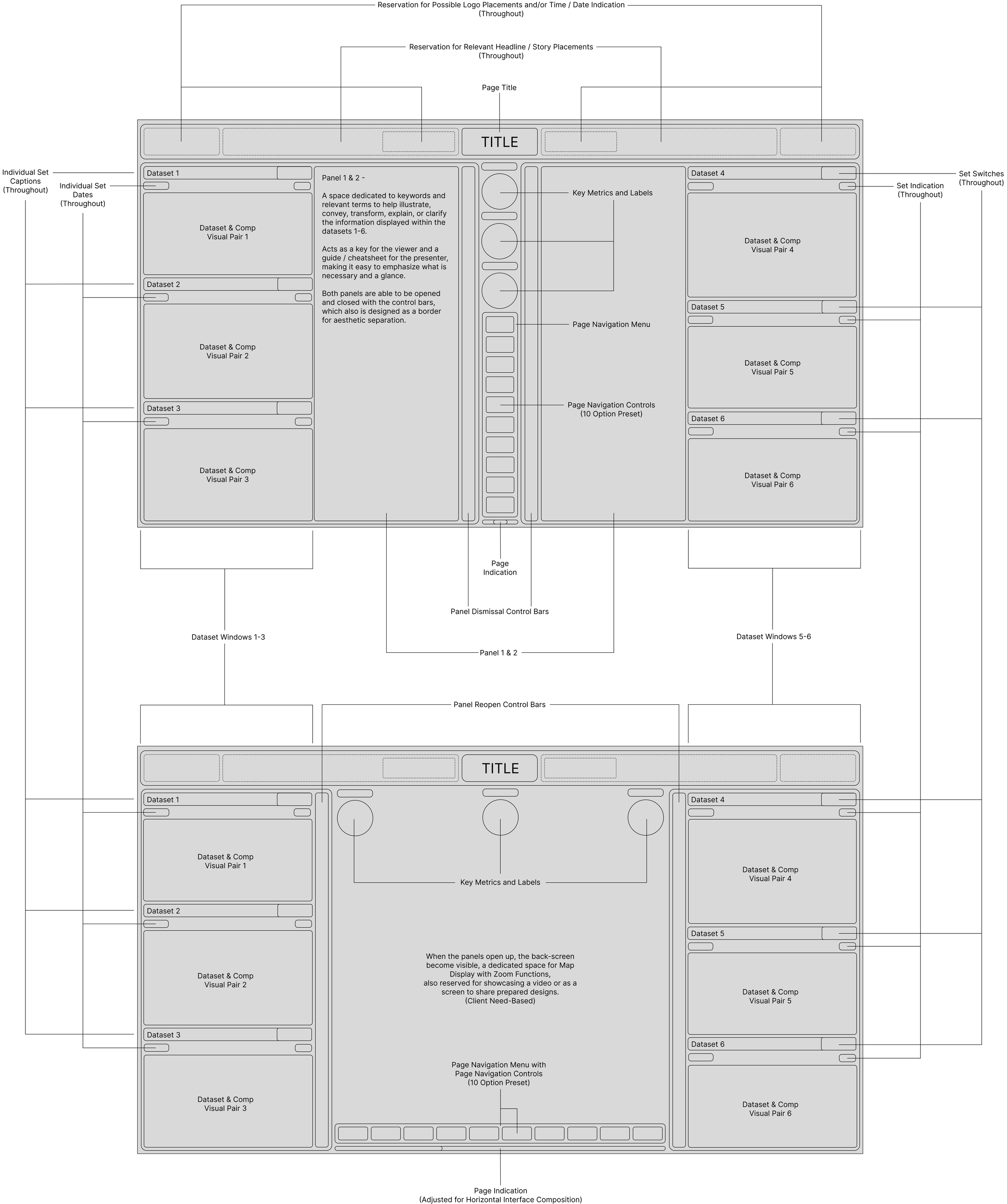
Existing Interfaces
Interface 1
Interface 2
Dashboard and Navigation
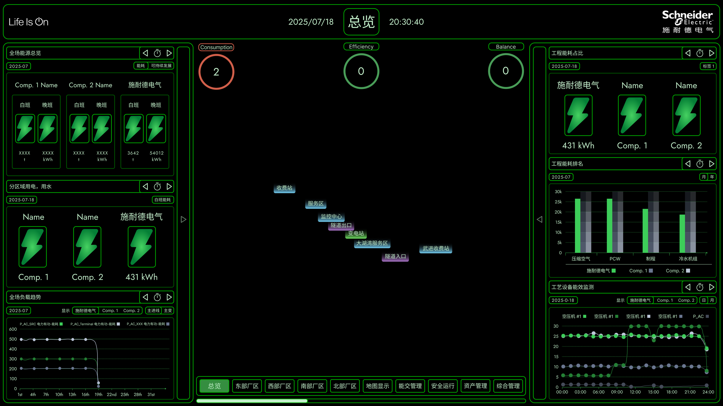
The biggest issue is that there lacks a clear indication of data freshness, and reliability status. Without any standard industry metrics to compare against or contextual preface of the general industry context, it is hard to properly and effectively gauge the quality of the data shown, and why it is to be perceived the way the interface displays, creating a fundamental trust gap minimizing call-to-action impact.
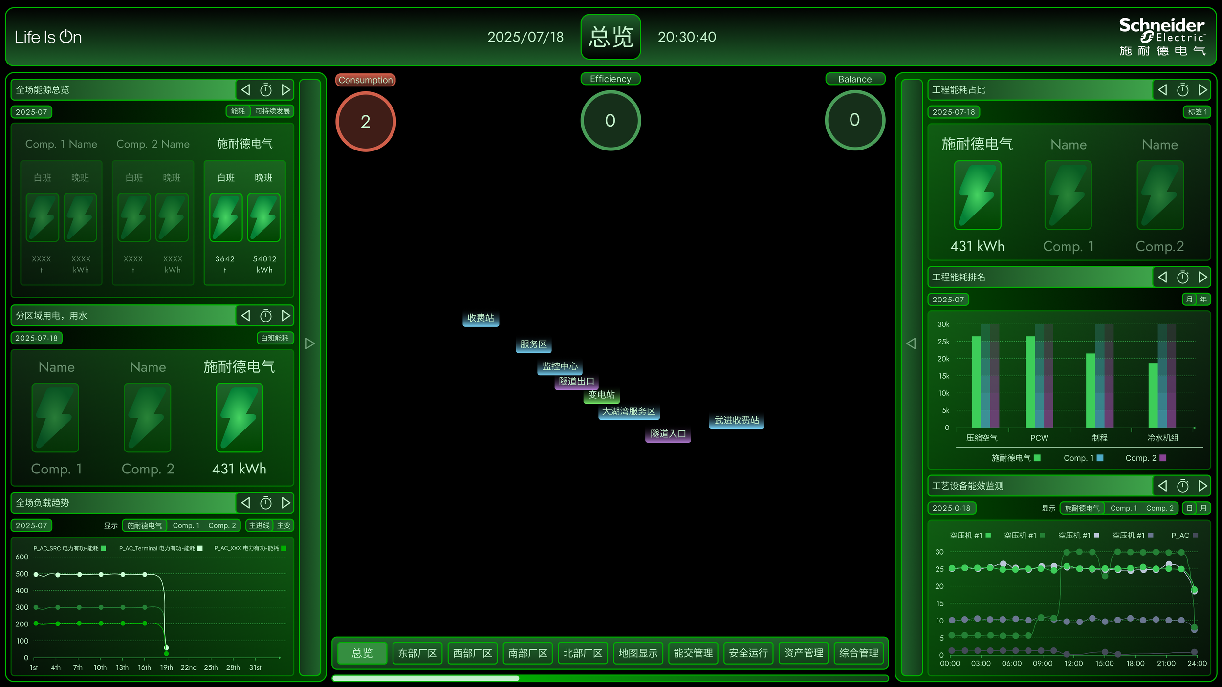
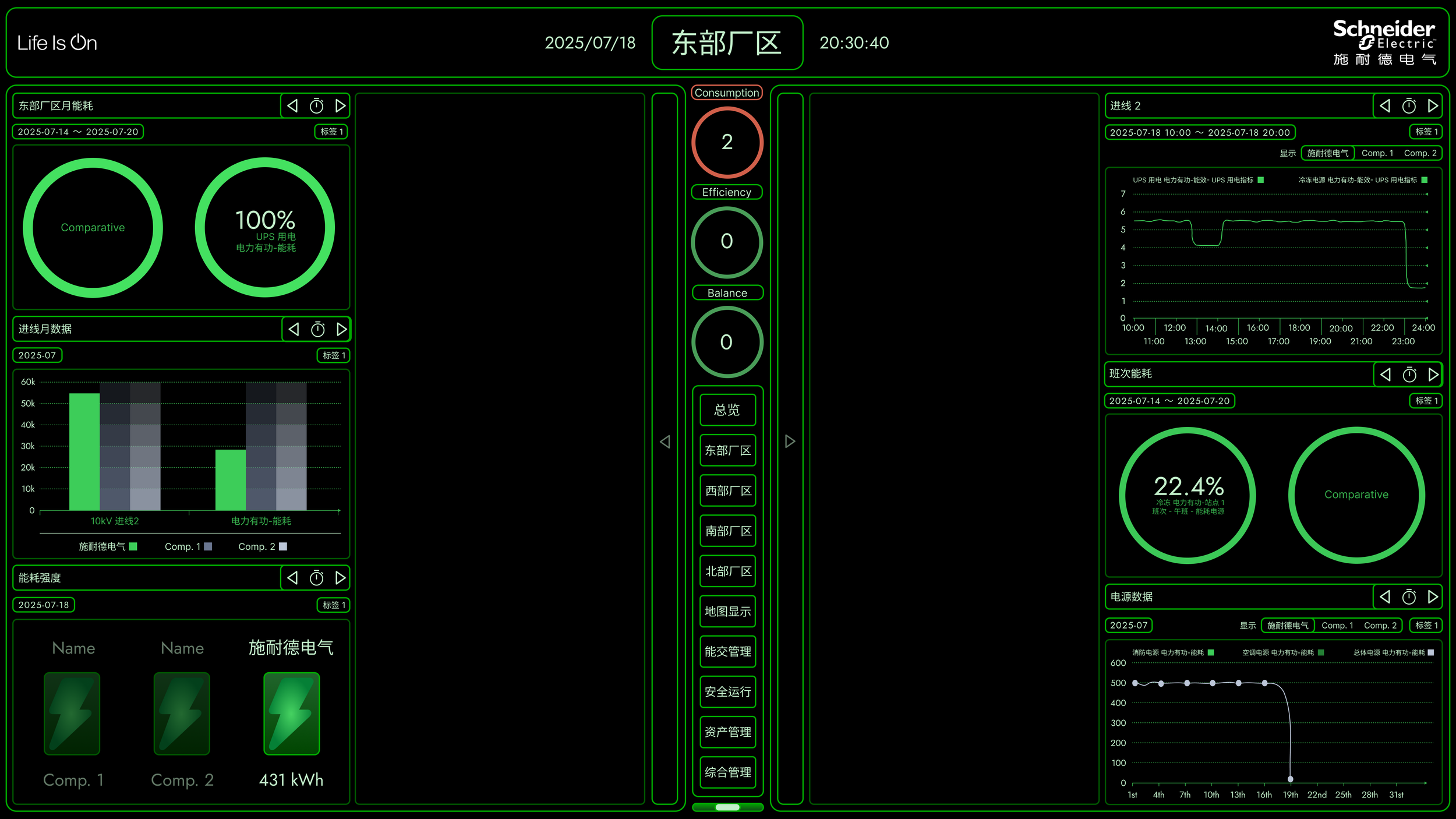
Prominent Issues
Typography Choices
The interface is designed for boardrooms and to be displayed on screens 35 inches to 40 inches, meaning that small text elements will be illegible from typical viewing distances of 10-15 feet. The illegibility is further compromised by the typography choices of the Chinese characters, whereby the characters contains serif, exemplified by additional ears, drops, and flags, typically not suitable for a minimalistic backdrop. Further more, the areas of the overall design using Chinese and English are not properly declared, and could create confusion for those with visual and language inconsistency. Finally, the typography used for certain number data lack sufficient weight and contrast to be "scannable" during presentations.
Information Hierarchy
Entirety of the interface is made in low contrast, causing the data hard to understand. It could cause inefficient and ineffective vision transfers in executive level decision making and meetings. Certain elements do not stand out visually enough, and the overall aesthetic prioritizes style over readability, choosing an almost gamified presentation of data, which is counterproductive in boardroom settings.
Data Presentation
When viewed as a whole, there resides too many visual stimuli for data points, and could create cognitive overload. The problem is not in the amount of data displayed, but rather the unbalanced organizational composition which lacks any clear visual emphasis on KPIs vs. supporting metrics, and neglects the path of focus for the viewer. Throughout the design, jagged angles are being placed to substitute for negative spacing, causing broken pieces of backdrop color and further shattering what little balance it had. The charts also lack proper labeling, and in multiple cases affect the quality of interpretation. Furthermore, the 3D holographic effects in Image 2 are too distracting, and not only reduced data clarity, but also overshadows more important information by fighting and ultimately capturing the viewer’s attention.
Presented Solution
Competitive Benchmarking Integration
One of the core improvements in the redesigned interface is the seamless integration of competitive benchmarking capabilities across all data visualizations. Unlike the original design where performance metrics existed in isolation, every chart, diagram, and data point now includes contextual comparison options that allow users to instantly gauge their performance against industry standards and competitors.
The circular progress indicators now feature dual-ring displays, where the inner ring shows actual performance while the outer ring represents industry benchmarks or competitor averages. This immediate visual comparison eliminates the guesswork in interpreting whether a 100% efficiency rating is exceptional or merely meeting baseline expectations.
Bar charts and time-series graphs incorporate overlaid comparison data through color-coded series, allowing users to track not just their own performance trends but also how they stack up against market leaders over time. Interactive toggles enable users to switch between different comparison sets—from regional averages to top-tier competitors—providing flexible context for strategic decision-making.
The facility comparison cards now display relative performance indicators alongside absolute values, using intuitive visual cues like percentile rankings and performance gaps. This approach transforms raw energy consumption data into actionable competitive intelligence, helping facility managers identify optimization opportunities and benchmark their improvements against industry best practices.
This integrated benchmarking approach ensures that users never view their data in a vacuum, providing the essential context needed for informed operational decisions and strategic planning.
Color Palette

Reimagined Designs
Standard Color Interface
Interface 1

Interface 2
Energy-Optimized Interface
Interface 1
Interface 2
Key Incentives
Dark Mode Energy Optimization
The minimal black-focused variant represents a significant step toward sustainable interface design, particularly for industrial monitoring environments that operate continuously. Visual analysis of the redesigned interface reveals approximately 75-80% of the screen area is now pure black, compared to the original green-dominant design where less than 15% of the screen utilized true black pixels.
Energy Savings Analysis
For OLED and AMOLED displays commonly used in modern industrial monitoring systems, this dramatic shift to black pixels delivers substantial energy savings. Estimate indicates that switching to dark mode on OLED devices can reduce power consumption by 39% to 47% when screen brightness is at 100%, with meaningful savings even at typical industrial brightness levels of 30-50%.
Environmental Impact at Scale
In industrial facilities running multiple monitoring displays 24/7, these savings compound significantly. A typical facility with ten 32" displays could reduce annual energy consumption by approximately 2,190-3,066 kWh, translating to $260-$370 in electricity savings and a reduction of 1,500-2,100 pounds of CO₂ emissions annually.
OLED screens consume less power when displaying darker images because individual pixels can be turned off completely, making this black-dominant design particularly effective for energy optimization. The interface maintains full functionality while dramatically reducing the environmental footprint—aligning perfectly with Schneider Electric's sustainability mission and providing quantifiable energy efficiency improvements for their industrial customers.RetryN
Projected Energy Savings by Screen Size:
24" Industrial Monitor: 15-20W reduction (from ~45W to 25-30W)
32" Control Panel Display: 25-35W reduction (from ~70W to 35-45W)
55" Wall-Mounted Dashboard: 45-60W reduction (from ~120W to 60-75W)