
Context / Preface
Ever since I met Xinyi, I've always been fascinated by her synesthesia—the neurological phenomenon where stimulation of one sensory pathway leads to automatic experiences in another. For synesthetes, letters might have inherent colors, sounds might evoke tastes, or numbers might occupy specific spatial positions.
What captivates me is how synesthesia reveals the deeply personal nature of perception: two people can look at the same letter 'A' and see completely different colors, yet each experience feels utterly natural and consistent to them.
Xinyi’s specific synesthesia is called Grapheme–color synesthesia, one of the most common ones, and yet in my opinion the most beautiful. Her synesthesia applies exclusively to symbols, and each letter, number, disregarding language or context, is assigned a color. Below is the project by Xinyi through which I learned both about synesthesia, and her. It is a paragraph written and encrypted based on her own specific synesthesia’s color correspondence.
I wanted to create a computational exploration of this phenomenon—not to replicate actual synesthetic experience, which is impossible without the neural wiring, but to create a system that could generate its own consistent cross-modal associations and allow viewers to experience the strange beauty of grapheme–color synesthesia. In a way, this project is dedicated to Xinyi.
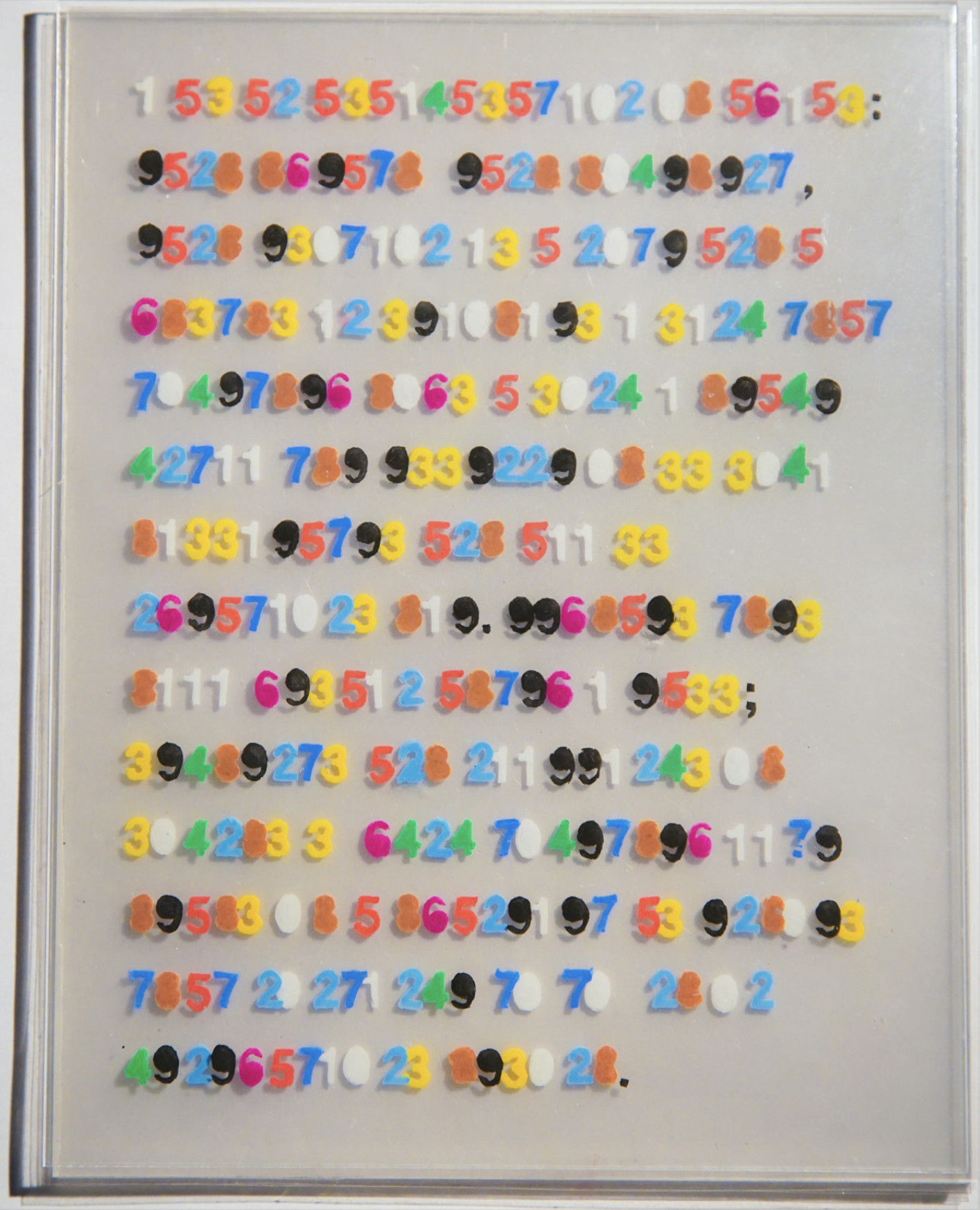
COLOURinG TRANSLATION
201046124 76523157102
Year: 2023
Media: Acrylic sheets, Posca markers, paper stencil, plastic
Dimensions: 8’’ x 10’’ x 2.4’’
by Xinyi Li
This is Xinyi’s project, which allowed me to have a slightest glimpse into her world. All credits & copyright @ Xinyi Li. Displayed w/ Permission.
“Visual Arts and English are the two main languages I employ for self-expression, alongside a third of my own Synesthesia creation—letter-number code. By matching the colour of each letter to a number, such as “a” and “5” which are both red, I can freely translate between the two. In “COLOUR- inG TRANSLATION”, I rendered a piece of my writing into numerical form, arranging the layers of color according to the perspective’s grayscale values (the darker it is, the closer it is and vice versa). The bold colors and rectangular, 3D format of the piece are evocative of text on printer paper, serving to replicate my experiences with coloured linguistics and high-light the fluidity of language.”
Initial Concept & FLORA
Within my AI research residency at FLORA, I began developing this project as a direct investigation of synesthetic perception through my collaborator Xin's experiences. Xin has grapheme-color synesthesia—she perceives specific, consistent colors for letters and numbers. Our core research question was: where exactly does synesthetic perception shift when a symbol morphs into another?
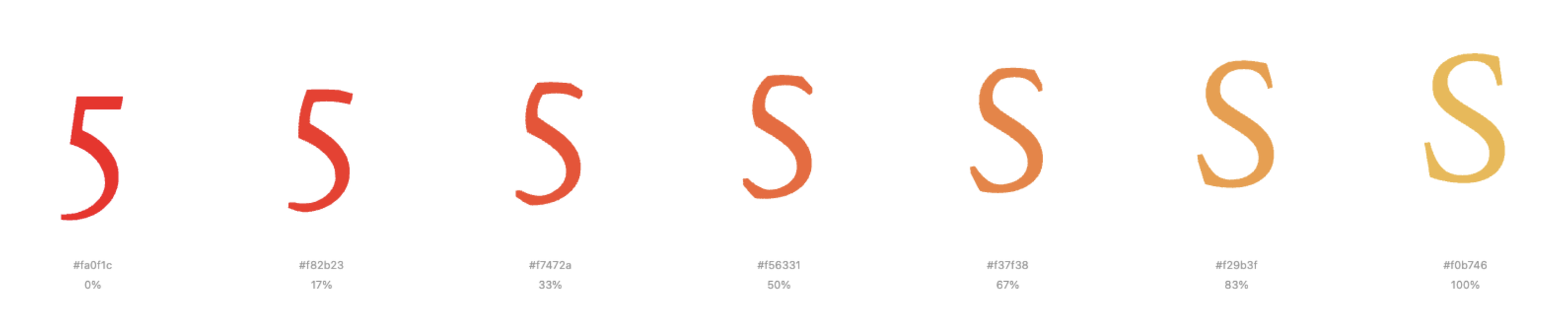
We identified pairs of alphanumeric characters that look similar but trigger different colors for Xin: S and 5, I and 1, O and 0, B and 8, D and 0, C and 1, Z and 2, F and E. If S is one color and 5 is another, at what precise moment during a morph between them does Xin's perception flip? Is there a middle state where the color wavers, or does it switch decisively at a single frame?
The concept was to use FLORA's generative capabilities—specifically models offering first-frame-last-frame interpolation—to create smooth morphing sequences between these character pairs. I would provide the starting symbol and ending symbol, and FLORA would generate the transitional frames between them. This was the chief reason I chose to attempt this project during my residency: FLORA's API could theoretically handle the computational heavy lifting of creating believable in-between states.
Once we had these morphing sequences, Xin would view them and mark the exact moment her synesthetic color perception changed. We would collect this data across all our similar pairs, then expand to map every letter to every number, building a comprehensive table of synesthetic transitions. The final output would be an interactive grid where users could select any two symbols and see both the average color between them (based on Xin's perception) and the visual gradient connecting their forms.
FLORA's framework offered an ideal environment for this kind of experimentation—rapid prototyping of generative sequences without building custom animation systems from scratch. The goal was something both systematic and intimate: a data-driven map of one person's perceptual reality, made navigable and visual for others.
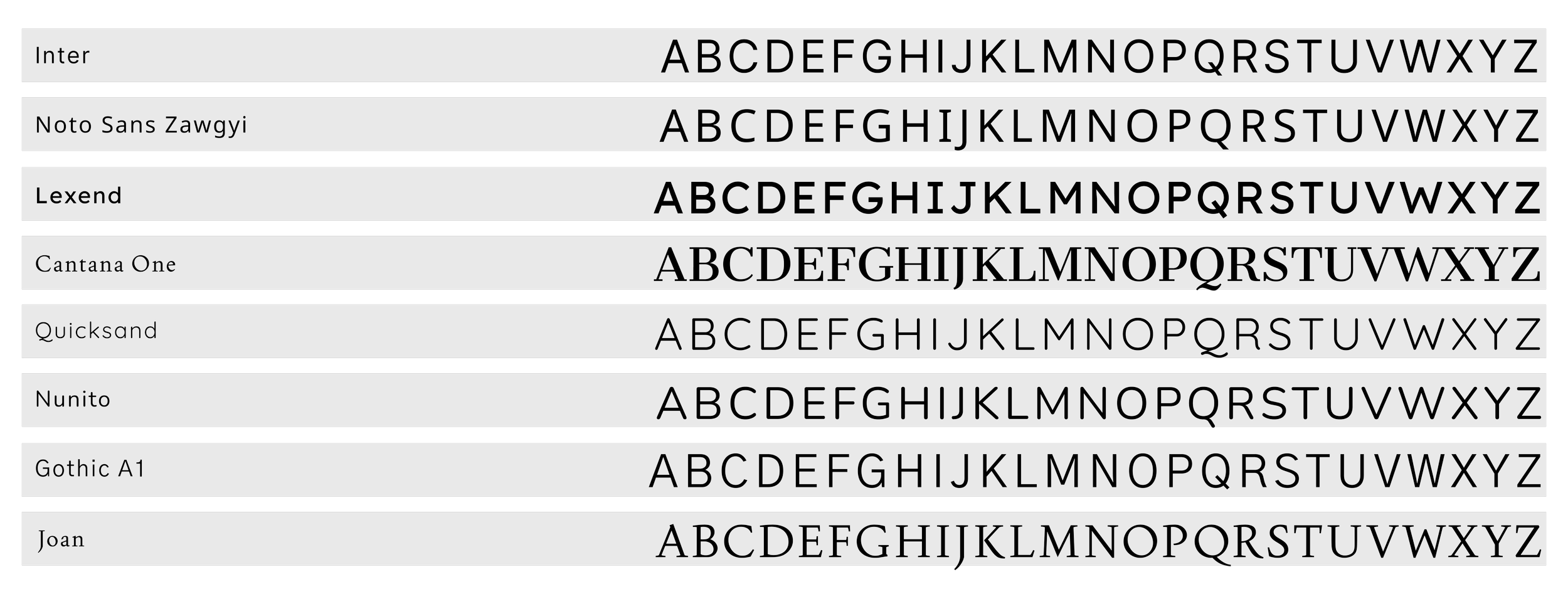
Font Selection
Choosing the right typeface was crucial to the project's success. We needed fonts that were geometrically simple and clean—extra curves, serifs, or decorative elements could interfere with the AI's ability to recognize and process letterforms consistently. The morphing algorithms relied on understanding the fundamental structure of each character, so visual noise had to be minimized.
We evaluated several options: Inter, Noto Sans Zawgyi, Lexend, Cantana One, Quicksand, Nunito, Gothic A1, and Joan. Each offered different approaches to simplicity and readability, but they varied significantly in how their letterforms would translate to computational interpretation.
Initially, this technical constraint drove our selection process entirely. But as the project evolved and we pivoted away from FLORA's AI-dependent framework, the criteria shifted. We were no longer bound by algorithmic interpretation requirements, yet we chose to stay with Joan.
Joan emerged as the final choice not just for its clean geometry, but for its elegance. Among the simple, sans-serif options we'd narrowed down, Joan struck the perfect balance—minimal enough to maintain visual clarity during morphing transitions, but refined enough to elevate the aesthetic experience. Its letterforms have a subtle sophistication that makes the grid feel less like a technical demonstration and more like a deliberate artistic statement.
The font became part of the project's identity, carrying forward from its AI-constrained origins into its final web-based form as a reminder that sometimes technical limitations lead us to aesthetic choices we'd want to keep anyway.
This is the Flora workspace (screenshot). We focused on image to text, text to image, image to video.
Moving Beyond
As the project evolved, I encountered fundamental limitations in what could be achieved within FLORA's framework. The level of granular control I needed over animation timing, the complexity of the morphing algorithms, and the interactive responsiveness I envisioned all required capabilities beyond what FLORA could provide.
The morphing animations needed precise easing functions and frame-by-frame control to create truly smooth transitions between letterforms and numerals. The grid system required responsive layout calculations that could adapt to different screen sizes while maintaining visual coherence. Most importantly, I wanted users to be able to interact with individual cells, pause animations, and explore the system at their own pace—interactions that demanded custom JavaScript and DOM manipulation.
The decision to move to independent web development wasn't abandoning the conceptual work done in FLORA, but rather recognizing that the vision had matured beyond what the residency framework could support. FLORA provided the space to develop the concept; now I needed full technical control to realize it.
Symbol Morphing
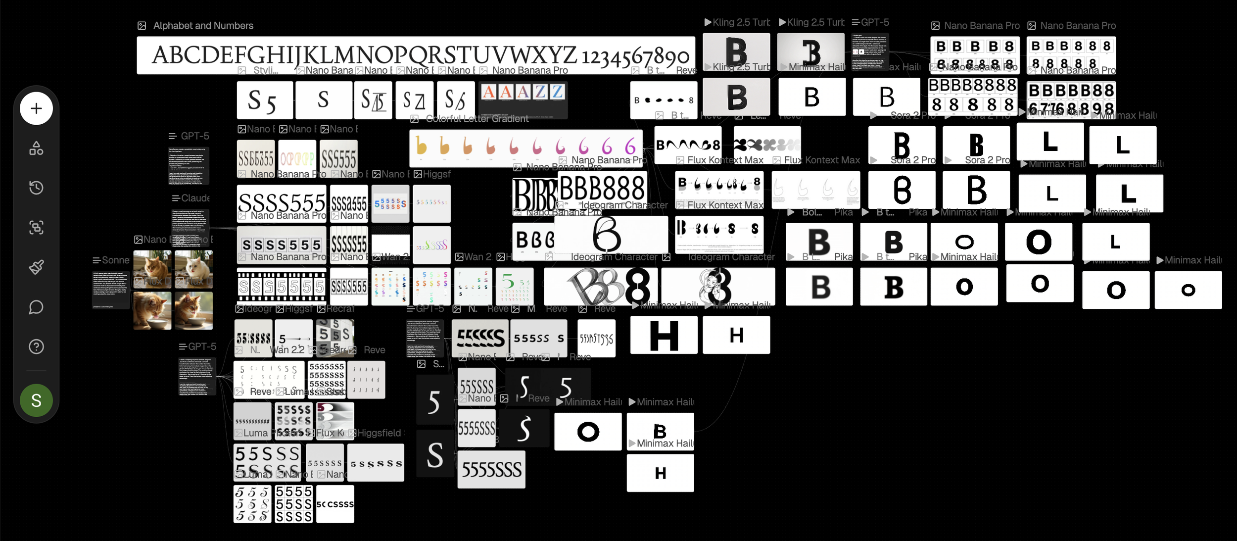
Building the synesthesia grid required solving a fundamental technical challenge: how to smoothly morph one alphanumeric character into another while maintaining visual coherence. The solution evolved through several algorithmic iterations, each addressing specific problems revealed through testing.
Algorithm Iterations
Version 1: Edge Detection w/ Nearest Neighbor
The initial approach seemed straightforward: detect the edge pixels of each rendered character, then connect them in sequence to form an outline. We identified all pixels that were filled but had at least one empty neighbor—these were the true boundary pixels.
However, connecting these edge pixels via "nearest neighbor" logic created a critical flaw. When the algorithm couldn't find an adjacent edge pixel, it would jump across the shape to continue tracing, creating visible diagonal lines that cut through the interior during morphing. The 1→I transition revealed this problem most starkly—strange angular intersections appeared in the middle frames where the algorithm had jumped across empty space.
Version 2: Moore-Neighbor Boundary Tracing
We replaced the nearest-neighbor approach with a proper Moore-neighbor contour tracing algorithm, a classic technique from computer vision. This algorithm walks pixel-by-pixel around the actual perimeter of a shape, always checking the 8 surrounding pixels in a specific order.
The process starts by finding the leftmost boundary pixel, then systematically searches for the next filled pixel by examining neighbors in a counter-clockwise pattern. It never jumps—it only moves to directly adjacent pixels, guaranteeing a continuous path with no intersections.
This solved the trailing line problem completely. Morphs became smooth and logical, with every point connecting naturally to its neighbor. The algorithm maintained proper winding direction (counter-clockwise) and returned to the starting point, creating closed contours suitable for filling.
Version 3: Multi-Part Letterforms
A new challenge emerged with letters like 'i' and 'j', which have disconnected components—a dot separate from the main body. The Moore-neighbor algorithm, designed for single contours, would trace only one part and ignore the rest.
We extended the algorithm to detect and trace multiple contours per character. After tracing the first boundary, it would search for any remaining filled pixels, trace their boundaries, and continue until all components were captured. This allowed proper morphing of complex letterforms while maintaining the integrity of each separate part.
Version 4: Inner Contours
The next refinement addressed hollow characters like 'O', '0', '8', and '6'. These letters have both outer boundaries and inner holes, but the algorithm was only tracing outer contours. During morphing, the interior spaces would appear incorrectly filled.
We implemented hole detection—after tracing the outer boundary, the algorithm would search for interior contours where filled pixels bordered the inside of the shape. Each hole received its own boundary trace with reversed winding direction (clockwise for holes, counter-clockwise for outer edges). This ensured proper rendering of negative space during morphing transitions.
Version 5: Point Count Normalization
With clean contours established, we faced a timing problem: different characters had vastly different numbers of boundary points. A simple 'I' might have 50 points while a curvy 'S' had 300. Direct interpolation between mismatched point counts created uneven morphing speeds—some parts of the shape would animate faster than others.
The solution was intelligent point count normalization. We standardized each contour to approximately 300 points through a simplification algorithm that preserved shape fidelity while ensuring consistent point density. This allowed frame-by-frame interpolation between corresponding points, creating uniform animation speed across all morphs.
Version 6: Orientation Awareness
The final major refinement addressed shape orientation. When morphing between characters with different facing directions—like 'C' opening left versus '1' being vertical—the algorithm could produce awkward, spinning transitions.
We implemented orientation analysis that detected the primary axis and opening direction of each shape, then intelligently rotated point indices to align corresponding features. This ensured that 'C' morphing into '1' would smoothly close and straighten rather than rotate unnaturally.
The Final Algorithm
The completed algorithm successfully handles the full complexity of alphanumeric morphing: tracing clean boundaries with no jumps, capturing multi-part letterforms, preserving inner holes, normalizing point counts for smooth animation, and aligning orientations for natural transitions. Each character pair in the grid—whether similar like 'S' and '5' or dissimilar like 'Q' and '3'—morphs through a continuous, logical sequence of intermediate forms.
This technical foundation enabled the interactive grid interface where users can explore any combination of letters and numbers, watching the precise moment where one symbol's identity dissolves into another's—a computational analog to the perceptual boundaries experienced in synesthesia.
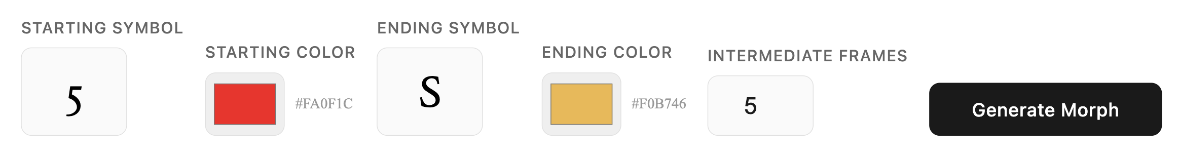
Symbol Morph Visualizer
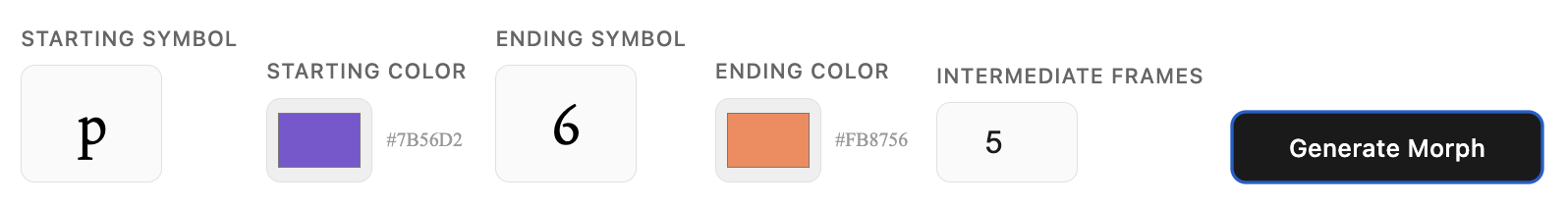
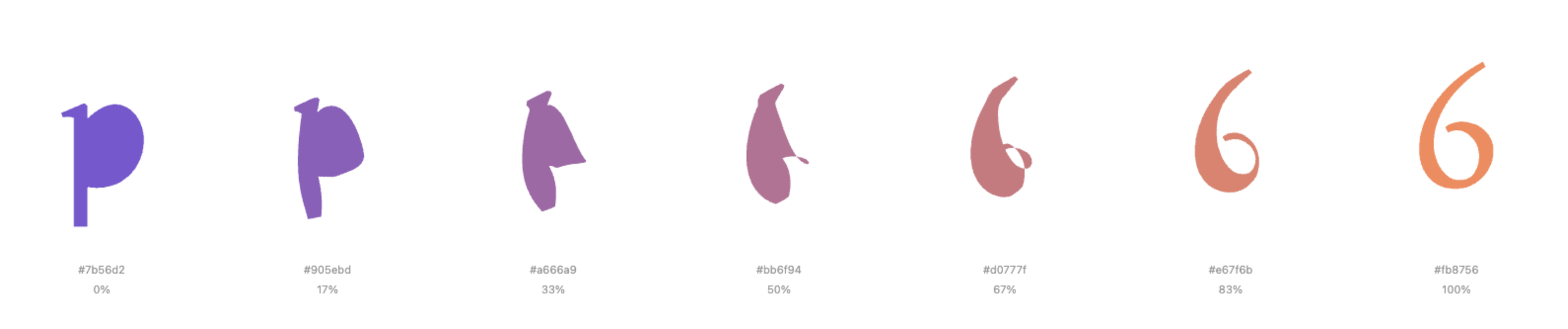
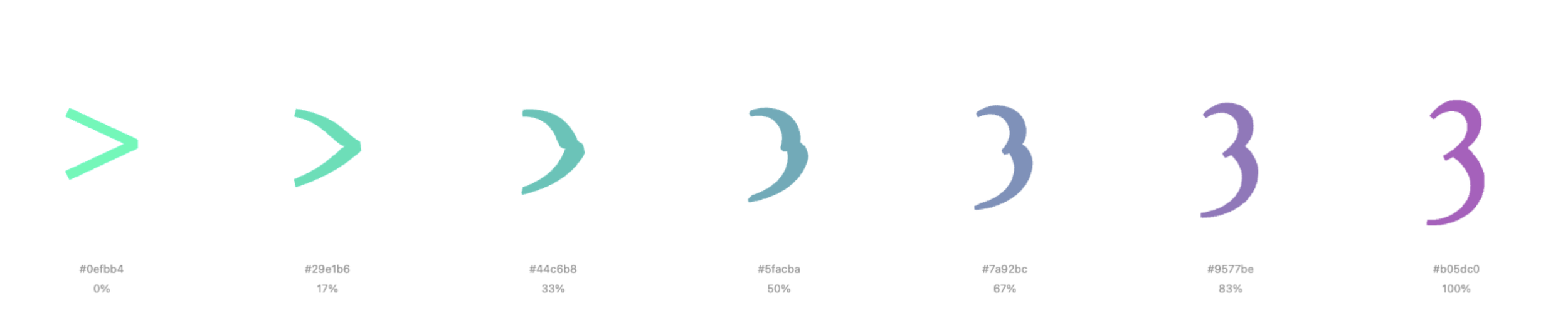
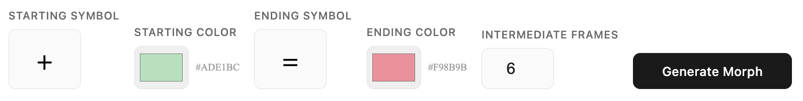
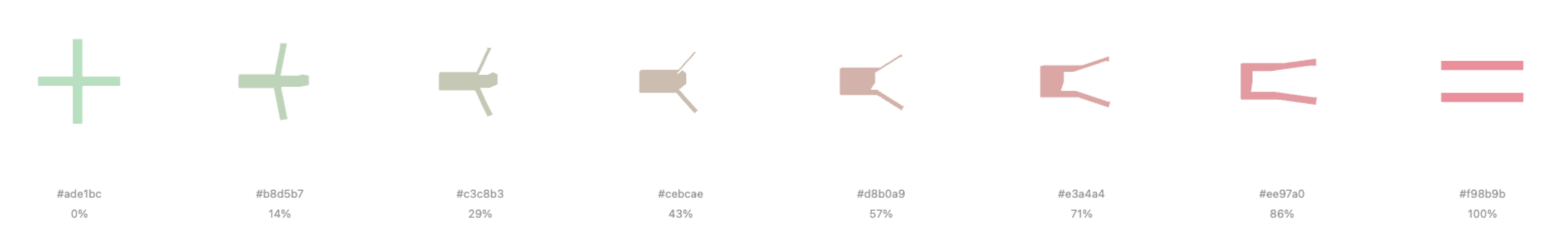
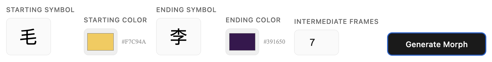
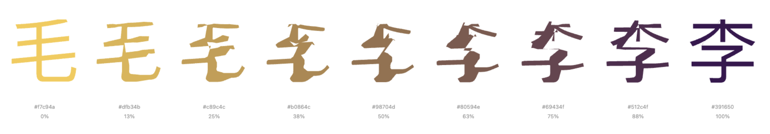
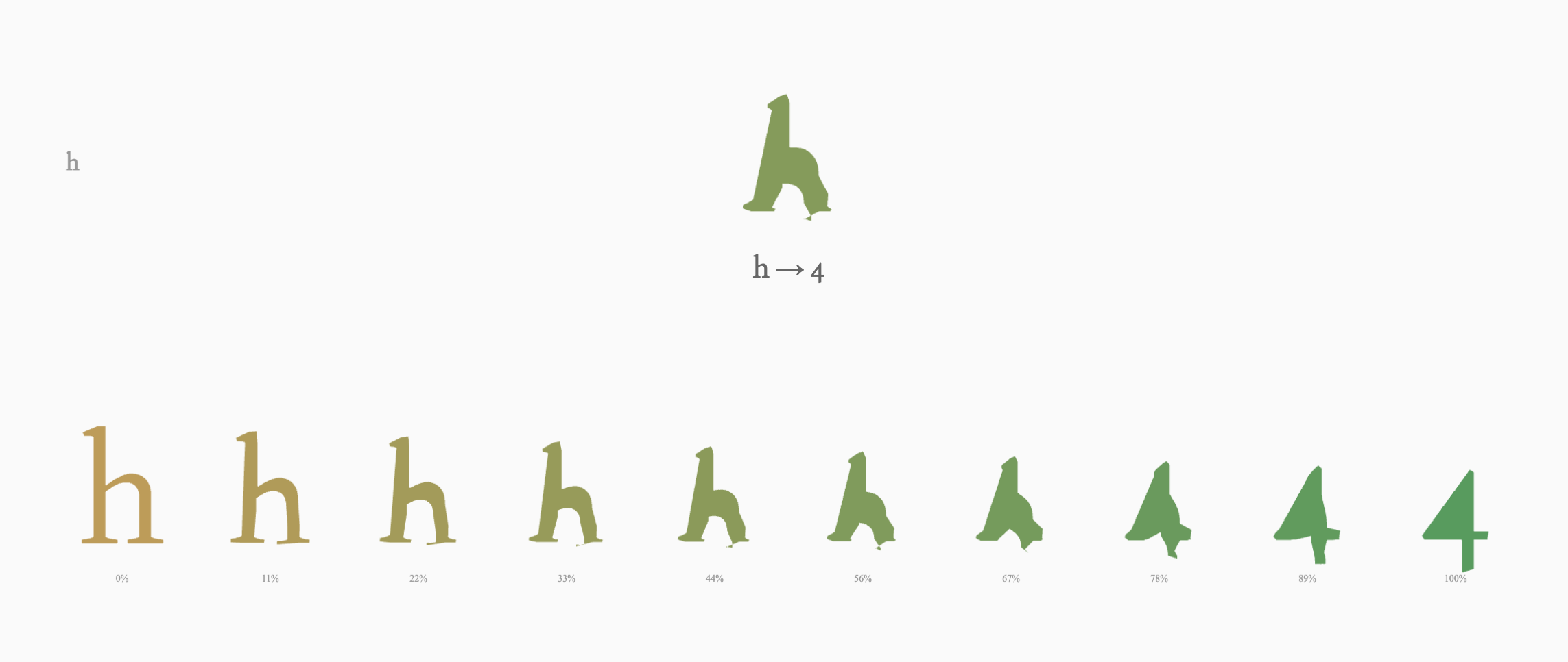
This is the fundamental visualizer I first made. It allows user to customize a starting symbol, alongside its starting color, and also the pairing ending symbol and its color. It applies the aforementioned algorithm, and allows the user to specify the number of intermediate frames (not including the starting and ending frame, since both symbols are standalone, untampered symbols) to generate—typically between 5 and 20 steps. The system then renders the complete morphing sequence in a clean horizontal layout, with each frame labeled by its interpolation percentage and hex color value. This linear presentation makes it easy to identify the precise moment where perceptual boundaries shift, which was essential for our original research goal with Xin's synesthetic experiences.
It is notable that it allows for font specificity, as well as capitalization specificity. Font: Joan (the same as this sentence, as well as all text you see on my site).

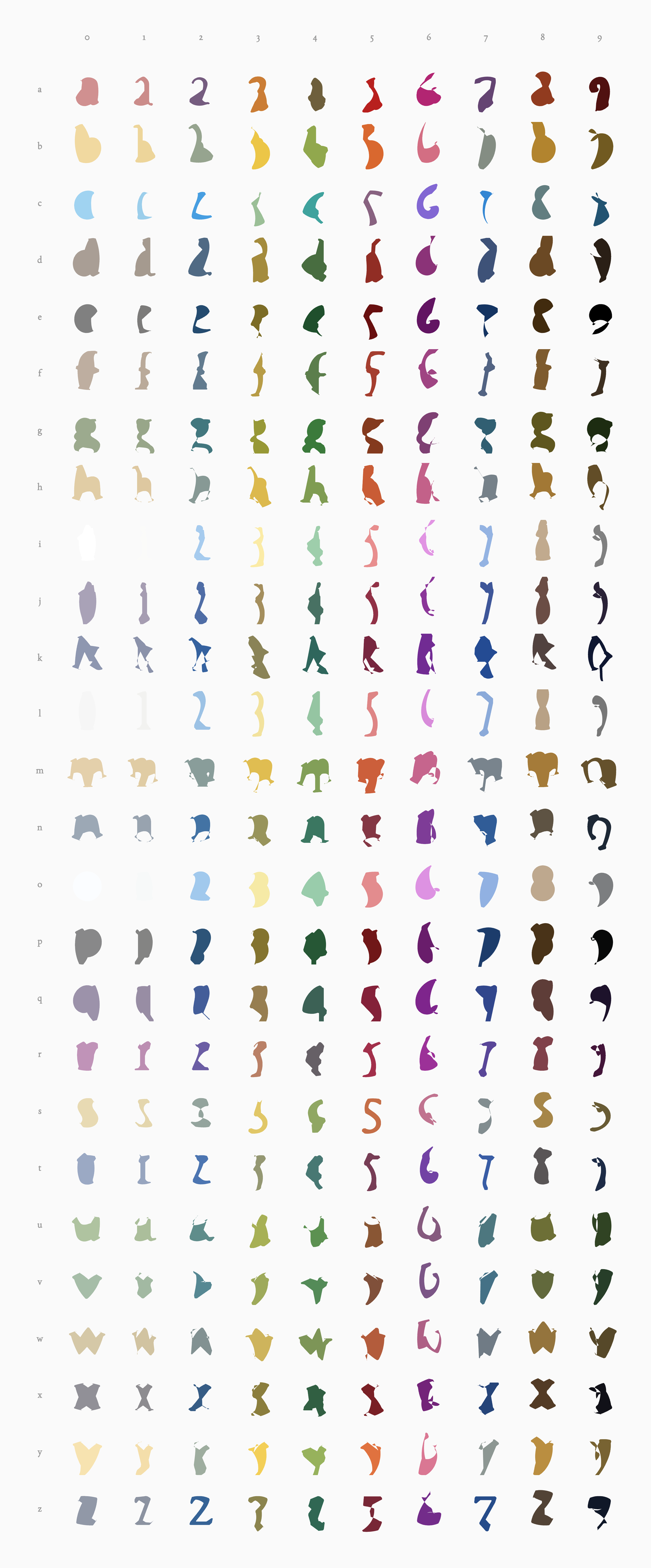
The Synesthesia Grid
The final visualization presents all 260 character combinations as a comprehensive 26×10 grid—each letter of the alphabet morphing into each digit from 0 to 9. What emerges is a striking visual taxonomy of transformation, where systematic logic produces unexpected aesthetic patterns. Horizontally, each row traces a single letter's journey across all ten numerals, revealing how the same starting form branches into radically different endpoints. Vertically, columns show how different letters converge toward the same number, illustrating multiple evolutionary paths to a single destination.
Each cell captures the precise midpoint of transformation—the 50% interpolation frame where one symbol's identity dissolves before acquiring another. The morphing happens through calculated interpolation between letterforms, creating transitional shapes that exist between our familiar symbols, occupying an ambiguous visual space that belongs to neither category yet somehow suggests both.
The color assignments create a secondary layer of visual rhythm across the grid. Each symbol carries its synesthetic color, and the morphs between them display smooth gradients that shift from one hue to another. This produces diagonal color flows and clustered regions of similar tones where morphologically related characters share chromatic proximity. The color palette shifts with each transformation, suggesting the synesthetic association between visual form and chromatic experience.
What emerges is neither purely random nor completely predictable. Like synesthesia itself, the system follows its own internal consistency that viewers can sense but not fully articulate. The boundaries between letters and numbers dissolve, revealing them not as fixed categories but as points along a continuous spectrum of symbolic form. The complete grid becomes a map of symbolic possibility, documenting the continuous spectrum underlying our discrete alphanumeric system.

Grid Functionalities
The interactive grid offers multiple modes of exploration, each designed to reveal different aspects of the morphing system. Users can toggle between Letter→Number orientation (26 rows × 10 columns) and Number→Letter orientation (10 rows × 26 columns), fundamentally reorganizing how transformations are grouped and compared. A letter case toggle allows switching between uppercase and lowercase letterforms, each producing distinctly different morphing sequences due to their varied geometries.

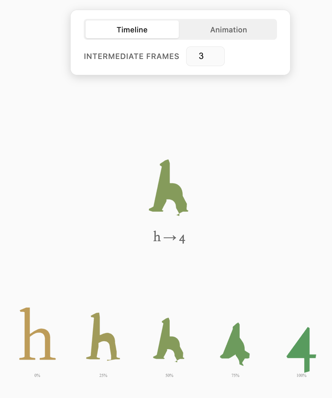
Clicking any cell in the grid expands that specific transformation, splitting the table apart with a distance-based opacity gradient that keeps the selected morph in sharp focus while maintaining contextual awareness of surrounding cells. The surrounding cells will split and dissappear, then showcasing the gradient morphing of the selected symbol pair, with a title centered to the View height and view width.
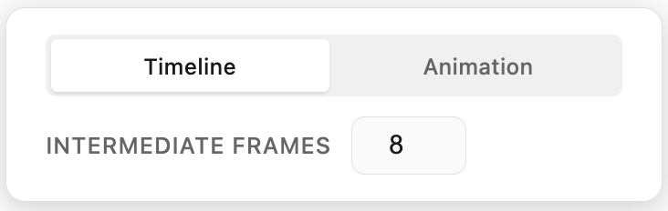
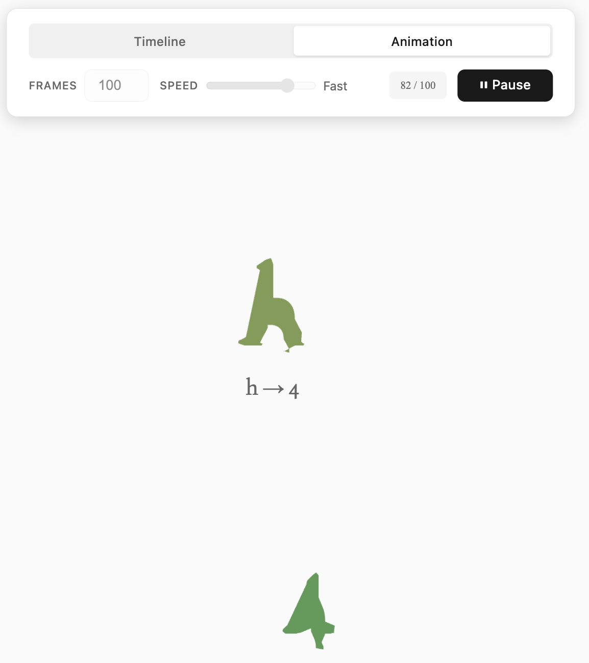
The expansion reveals a detailed frame control panel with two distinct viewing modes: Timeline and Animation.
Timeline Mode displays a sequence of static intermediate frames between the two symbols, with an adjustable frame count ranging from 3 to 20 steps. Users can examine each transitional state individually, identifying the precise morphological changes that occur at each stage. This mode serves the project's original research purpose—allowing frame-by-frame analysis of where perceptual boundaries shift.
Animation Mode generates a smooth ping-pong loop that continuously morphs between the two symbols. Users control both the total frame count (10 to 500 frames) and playback speed (15fps, 30fps, or 60fps), with a real-time frame counter tracking position within the sequence. The animation never simply loops forward—it plays forward to completion, then reverses back to the start, creating a hypnotic oscillation that emphasizes the continuity of transformation. Play and pause controls allow users to freeze on specific frames, while the system automatically disables parameter adjustments during playback to prevent jarring transitions.

A comprehensive Color Settings panel provides granular control over the synesthetic color mappings. Users can independently assign colors to each letter (both uppercase and lowercase) and each number, with all assignments persisting via localStorage across sessions. This allows for personal customization or replication of specific synesthetic profiles—users can experiment with their own chromatic interpretations or load predefined associations.
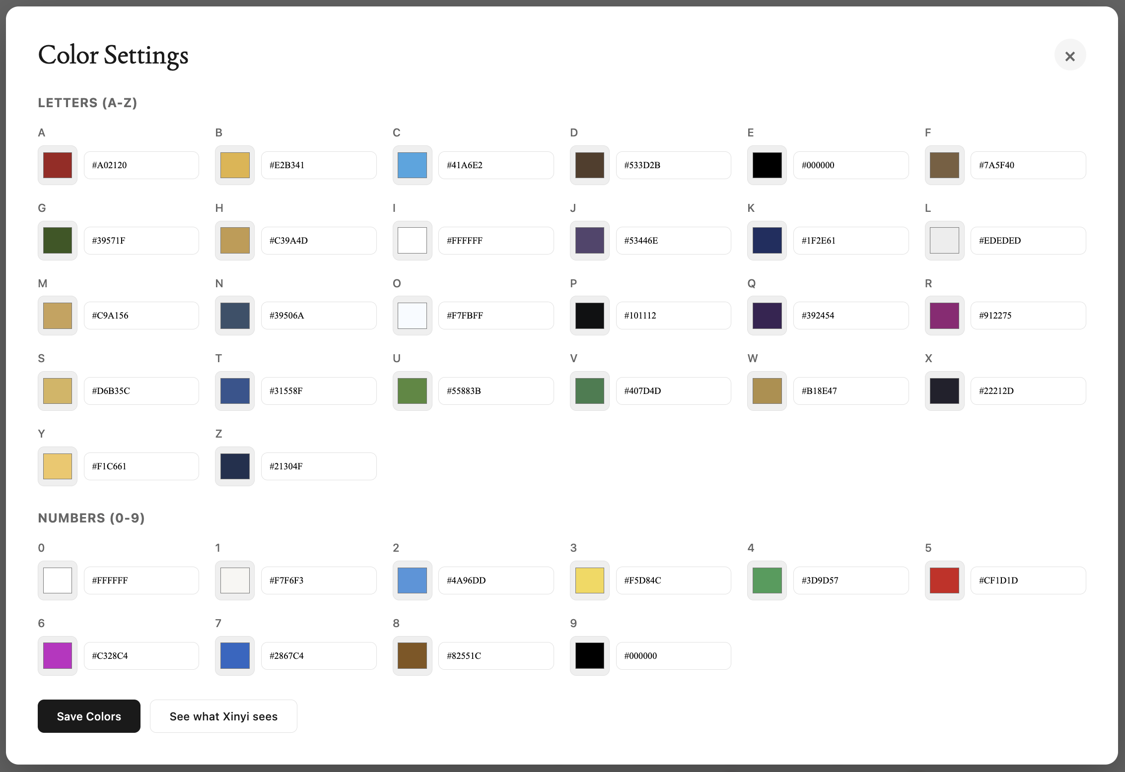

In this color panel, I chose to include a button labeled "See What Xinyi Sees." Clicking it would reset all letters and numbers to the palette Xinyi sees, based on preset HEXes she populated by hand, inviting me and the viewers into her lens. Her perceptual reality. Xinyi was my collaborator throughout the Flora portion of this project, and whose grapheme-color synesthesia sparked this entire investigation. Her specific, consistent color associations for each symbol formed the baseline data we originally sought to map and the idea for this vision. This feature acknowledges that while the tool allows anyone to explore symbol morphing through their own color lens, the research question that motivated the project was always grounded in one person's lived experience. Xinyi’s. I wanted to include her name somewhere explicitly, so that the interface would honor the one who let me borrow her palette and create this otherwise purely technical exercise. I want it to be a constant reminder that synesthesia isn't a theoretical concept but a daily, beautiful reality for individuals like Xinyi, and this grid attempts to make her invisible perceptual boundaries visible to others, as she did for me.